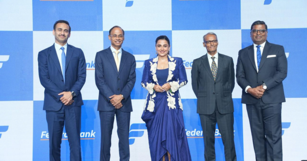
Mumbai: Federal Bank unveiled The Fortuna Wave, its refreshed brand identity that reflects the Bank’s evolution and desire to be contemporary and future-ready respectively. The launch took place in the presence of the Bank’s Leadership and the Brand Ambassador Ms Vidya Balan at Mumbai.
Refreshed for Salience to Success.
The Fortuna Wave, represents Authenticity, Prosperity and Togetherness, the Bank seeks for and from its Customers, Investors and Employees. The intent behind the refresh was to enhance the recognition and differentiation for the Federal Bank Brand. This will ensure a distinct, coherent, and continuous visual language across their physical and digital assets. The design aesthetics support the Brand to imprint itself in a contemporary manner amongst the next generation of Customers. The new identity is reflective of the Bank’s steady progression from a locally trusted brand to a national player with an increasing global presence in key businesses and markets.
Consumers, Businesses and Markets.
The brand refresh comes on the back of a strong push to increase wallet share across customer segments, scale new business, and leverage technology to create experiential differentiators. It is also aligned with our efforts to strengthen on-ground market presence—bringing emerging markets into prominence and enabling established markets to evolve into dominant contributors to the Bank’s portfolio. The Bank recognises that a brand refresh will enable easier and more consistent connection across these three variables, which need to be addressed simultaneously.
Foundation Focus. Future Fresh.
Federal Bank’s strength has been its multi-generational relationships and years of being in franchise in key geographies of India. All through its evolution the Brand has taken efforts to be Human at the Core, Digital at the ForeTM. The Bank has achieved a balance between being the ‘Go-to friend’ and technologically progressive company, and in doing so, earned the trust of the customers, shareholders and employees. The Brand refresh leans into the strengths while vaulting it for continued present day credibility and visibility. The “familiar yet fresh” look carries forward the legacy that generations of customers recognise, while aligning with the aspirations of a younger, digitally empowered audience.
Action oriented Aesthetics.
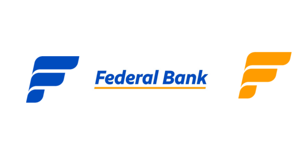
The word mark – FEDERALBANK, now has a more fluid, forward and round edge approach. These symbolise being approachable, ready with solutions and welcoming everyone with high levels of service delivery. The upper case has given way to well-rounded typeface which balances sharpness with warmth- symbolising precision without authority. Retaining the italicised style preserves the Bank’s unique visual DNA, and the familiar yellow underline continues to stand for partnership and support- reinforcing the Bank’s role as a trusted platform for customers. The boxed structure has been freed, allowing the logo to adapt fluidly across mediums and digital touchpoints.
Mumbai: Federal Bank unveiled The Fortuna Wave, its refreshed brand identity that reflects the Bank’s evolution and desire to be contemporary and future-ready respectively. The launch took place in the presence of the Bank’s Leadership and the Brand Ambassador Ms Vidya Balan at Mumbai.
Refreshed for Salience to Success.
The Fortuna Wave, represents Authenticity, Prosperity and Togetherness, the Bank seeks for and from its Customers, Investors and Employees. The intent behind the refresh was to enhance the recognition and differentiation for the Federal Bank Brand. This will ensure a distinct, coherent, and continuous visual language across their physical and digital assets. The design aesthetics support the Brand to imprint itself in a contemporary manner amongst the next generation of Customers. The new identity is reflective of the Bank’s steady progression from a locally trusted brand to a national player with an increasing global presence in key businesses and markets.
Consumers, Businesses and Markets.
The brand refresh comes on the back of a strong push to increase wallet share across customer segments, scale new business, and leverage technology to create experiential differentiators. It is also aligned with our efforts to strengthen on-ground market presence—bringing emerging markets into prominence and enabling established markets to evolve into dominant contributors to the Bank’s portfolio. The Bank recognises that a brand refresh will enable easier and more consistent connection across these three variables, which need to be addressed simultaneously.
Foundation Focus. Future Fresh.
Federal Bank’s strength has been its multi-generational relationships and years of being in franchise in key geographies of India. All through its evolution the Brand has taken efforts to be Human at the Core, Digital at the ForeTM. The Bank has achieved a balance between being the ‘Go-to friend’ and technologically progressive company, and in doing so, earned the trust of the customers, shareholders and employees. The Brand refresh leans into the strengths while vaulting it for continued present day credibility and visibility. The “familiar yet fresh” look carries forward the legacy that generations of customers recognise, while aligning with the aspirations of a younger, digitally empowered audience.
Action oriented Aesthetics.
The word mark – FEDERALBANK, now has a more fluid, forward and round edge approach. These symbolise being approachable, ready with solutions and welcoming everyone with high levels of service delivery. The upper case has given way to well-rounded typeface which balances sharpness with warmth- symbolising precision without authority. Retaining the italicised style preserves the Bank’s unique visual DNA, and the familiar yellow underline continues to stand for partnership and support- reinforcing the Bank’s role as a trusted platform for customers. The boxed structure has been freed, allowing the logo to adapt fluidly across mediums and digital touchpoints.
Upending the Brand.
The new logo and insignia enhance visibility, legibility, style, tone, colour usage and adaptability. It underlines the warmth and approachability of the Bank’s Business Philosophy. The sentence-case format has given way to balance between professionalism and friendliness.
The Fortuna Wave will have multiple variations optimized for different backgrounds, contexts and moment marketing initiatives. This flexibility ensures consistent brand representation across digital and physical touchpoints.
The primary colours are more distinct, vibrant, and youthful, ensuring that the brand stands out to establish a strong, standalone identity. The updated palette reflects its commitment to a modern, dynamic brand image while preserving the essence of trust and reliability associated with the BFSI sector.
Commenting on the brand refresh, the MD & CEO KVS Manian said: “Our refreshed brand identity represents a gentle evolution rather than a change in direction. This renewed expression brings a more contemporary and dynamic presence. It signals our preparedness for the future, without losing sight of the principles that have always defined us. While the look and feel have been renewed, the heart of Federal Bank remains the same. The core values that have shaped us over decades—trust, authenticity, and a deep commitment to our customers—continue to guide us”.
Speaking on the Brand intent, the Chief Marketing Officer M V S Murthy said, “Being a legacy brand gives us a vantage point to bring the best of our past, into the present and fuel our future progress. Across the time lapse, a Brand Refresh is a great opportunity to be contemporary as we enhance our product and service propositions. Visual connect, though has many an unspoken word, it is the first impression for a brand. Discerning generation of customers coming up seek for more intuitive expressions of communication. Our refreshed identity morph into the Fortuna Wave promise Authenticity, Prosperity and Togetherness. These are Brand Values we cherish and demonstrate our intent through our engagements and experiences curated out for the Brand.”
Vidya Balan, the Brand Ambassador during the event said, “Federal Bank reflects aninstitution secure in its foundations, clear in its direction, and committed to building a strong, sustainable franchise for the future. In my profession, there is a constant need to refresh and reinvent oneself. You are as good as your last hit. I feel overjoyed when the Brand whom I represent, take equal amount of conscious effort for strengthening relevance. Their effort comes at a time when discernment is sharp amongst audiences.”
The refreshed identity was shaped in close collaboration with Sideways, bringing together strategic clarity and creative expression to articulate Federal Bank’s evolving role as a digitally confident, nationally present institution with human connection at its core.
Sharing perspective on the brand’s evolution, the founder of Sideways, Abhijit Avasthi, said, “At Sideways, our role was to help Federal Bank express who it has already become. This refresh is not a reinvention but a considered evolution: one that carries forward the trust the Bank has built over decades while giving it a more contemporary, digital-first expression. Every element of the identity was designed to balance progress with familiarity, ensuring it feels confident and future-ready without losing its human core. The result is a brand that is clear in its purpose, secure in its foundations, and ready to serve a growing, changing nation.”
Read more: KVS Manian Takes Charge as the New MD & CEO of Federal Bank
![]()