Published on: December 8, 2025
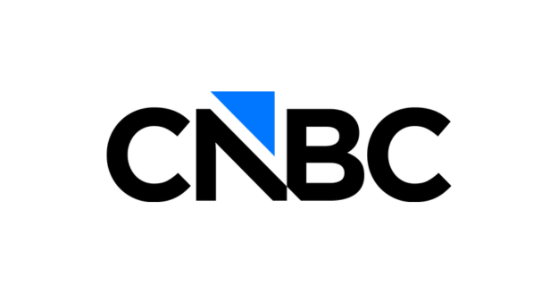
CNBC has introduced a redesigned logo as it prepares for its shift away from NBCUniversal and into the newly formed Versant Media Group. As part of this evolution, the long-standing peacock symbol—used since the mid-1990s—will be phased out in favour of a modern, simplified visual identity described by the network as “a new mark for our next chapter.”
The updated branding will officially roll out across all CNBC touchpoints starting Saturday, December 13, 2025, marking a significant step in its repositioning under Versant. While the network will continue to operate under the name “CNBC,” its visual system has been refreshed to reflect a more independent and contemporary direction.
In contrast to the transformation of sister channel MSNBC—now rebranded as MS NOW—CNBC’s change is focused solely on the logo, signalling continuity of name but evolution in identity.
The new design features a sleek, minimalistic look, replacing the colourful peacock with an upward-pointing arrow that represents market momentum and financial confidence—an apt symbol for a business and finance broadcaster. Analysts suggest the shift aligns with Versant’s broader efforts to redefine its portfolio and prepare for a public offering.
As CNBC moves into this new era, the refreshed mark aims to merge its storied heritage with a forward-looking strategy. The impact of the new identity will unfold in the months ahead.
Read more: Nikhilesh Pillay Takes On Senior Manager – Marketing Role At Crunchyroll